
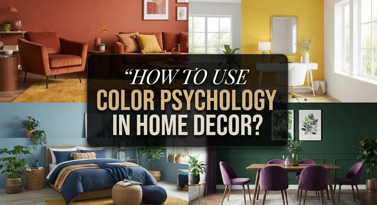
How to Use Color Psychology in Home Decor?
Have you ever walked into a room and felt instantly calm? Or maybe a space made you feel energized without knowing why?
That is color psychology at work. The colors around you shape your mood more than you think.
Every shade sends a message to your brain. Blues can feel calming. Yellows can feel cheerful. Reds can feel bold and exciting.
This article will show you how to use color psychology in home decor. You will learn how to pick colors that match the feeling you want in each room.
We will cover the basics of color theory. You will discover the difference between warm and cool tones. We will also explain the 60-30-10 rule for balancing colors in any space.
Lighting plays a big role too. The same paint color can look different in morning light versus evening light.
By the end, you will know how to avoid common color mistakes. You will also learn how to mix textures and tones for a space that feels both balanced and alive.
Let’s explore how color can transform your home.
In a Nutshell
Here is a quick summary to help you get started with color psychology in your home:
-
Pick a mood first. Decide how you want each room to feel before choosing any color. This makes your decor choices easier and more personal.
-
Follow the 60-30-10 rule. Use 60% for your main color, 30% for a secondary shade, and 10% for accents. This keeps rooms balanced and visually pleasing.
-
Balance bright and soft tones. Mixing vibrant colors with calmer hues stops a room from feeling too intense. It also keeps the space comfortable to be in.
-
Watch your lighting. Natural and artificial light change how colors look throughout the day. Always test paint swatches in different light before committing.
-
Add texture and variety. Do not rely on one flat color across a whole room. Textures and slight color shifts make spaces feel warmer and more layered.
-
Avoid blind trend-following. Choose colors that reflect your personality and comfort. Trends fade, but your happiness in the space should not.
What Is Color Psychology and Why It Matters in Home Design
Color psychology is the study of how colors affect our emotions and behavior. When you choose colors for your home, you are actually shaping how people feel in each space. Colors communicate directly with your brain, triggering emotional responses before you even think about it.
Different colors carry different meanings. Warm tones like red, orange, and yellow create energy and warmth. Cool tones like blue, green, and purple bring calm and relaxation. Understanding this difference helps you pick the right mood for each room.
Why does this matter for your home? Your living space influences your daily life. The colors surrounding you affect your stress levels, productivity, and overall happiness. A bedroom painted in energizing red might keep you awake at night. A kitchen in soft blue might make you feel less hungry.
Color psychology also considers how colors work together. Some combinations feel harmonious and pleasing. Others clash and create tension. This is where color theory comes in. It gives you a framework for making smart choices instead of guessing.
Lighting plays a huge role too. A color looks completely different under natural sunlight versus artificial bulbs. Morning light shows colors differently than evening light. This is why testing paint samples at different times matters.
The practical benefit? You can intentionally design spaces that support your needs. A home office benefits from colors that boost focus. A living room thrives with colors that encourage connection. A bathroom works well with colors that promote relaxation.
Understanding color psychology removes the guesswork from decorating. You move from random choices to purposeful decisions. This knowledge helps you create spaces that genuinely feel good to live in.
Understanding the Color Wheel: Warm Tones vs. Cool Tones
The color wheel divides into two main families: warm tones and cool tones. Understanding this split helps you create the right feeling in any room.
Warm tones include reds, oranges, and yellows. These colors feel like sunshine and fire. They energize spaces and make rooms feel cozy and inviting. Warm tones work well in living rooms, kitchens, and dining areas where you want people to gather and feel comfortable.
Cool tones include blues, greens, and purples. These colors feel calm and peaceful. They remind us of water, sky, and nature. Cool tones are perfect for bedrooms, bathrooms, and home offices where you need focus or relaxation.
Here is the key difference: warm tones advance toward you visually. They make spaces feel smaller and more intimate. Cool tones recede away from you. They make spaces feel larger and more open.
You do not have to pick only warm or only cool. The best approach mixes both families. A bedroom might use cool blue as the main color but add warm accent pillows or artwork. This balance prevents a room from feeling one-dimensional.
Lighting changes how warm and cool tones appear. Natural daylight shows colors most accurately. Artificial warm lighting (yellow bulbs) makes cool colors look less vibrant. Artificial cool lighting (white bulbs) strengthens cool tones.
Consider your room’s purpose first. Does it need energy or calm? Does it feel too small or too large? Answer these questions, then choose your warm or cool base color. Add the opposite family as accents to create depth and interest without overwhelming the space.
How to Define the Right Mood for Each Room
Start by asking yourself what feeling you want when you enter each room. Do you want to feel calm and peaceful? Or energized and creative? Your answer guides everything that comes next.
Bedrooms typically call for restful moods. Think about colors that help you relax and sleep well. Cool tones like soft blues, gentle greens, and muted purples work beautifully here. These colors slow your heart rate and signal your body to wind down.
Living rooms often need balance. You might want a space that feels welcoming yet comfortable for long hours. Warm neutrals paired with accent colors create this mix. Consider what activities happen here. Do you host gatherings? Do you read quietly? Your answer shapes the color direction.
Home offices demand focus and motivation. Some people work best with energizing warm tones like soft oranges or warm yellows. Others concentrate better with cool, clear blues. Test what helps your mind stay sharp.
Kitchens benefit from appetite and energy. Warm tones stimulate conversation and appetite. However, avoid overwhelming intensity. Pair warm colors with lighter neutrals to keep the space functional and pleasant.
Bathrooms work well with spa like feelings. Cool tones create that peaceful, clean sensation. Soft greens and pale blues make bathrooms feel like personal retreats.
The key step is defining your mood first, then matching colors to it. Write down how you want to feel in each room. List three to four emotions that matter most. Then explore which colors naturally support those feelings. This approach removes confusion and creates spaces that truly serve your lifestyle and wellbeing.
Mastering the 60-30-10 Rule for Balanced Color Palettes
The 60-30-10 rule gives you a simple framework for color balance. This formula prevents your room from feeling chaotic or boring. It works by dividing your color choices into three clear percentages.
Your dominant color makes up 60 percent of the room. This is usually your wall color or largest furniture piece. Choose something you genuinely love because you will see it constantly. This color sets the foundation for everything else in your space.
The secondary color fills 30 percent of your room. This supports your dominant color without competing for attention. You might use this on accent walls, larger furniture, or window treatments. This color should complement your main choice while adding visual interest.
Your accent color represents just 10 percent of the space. Think of this as your creative opportunity. Use it on small items like throw pillows, artwork, or decorative objects. This percentage allows you to introduce bold or unexpected colors safely. You can change accent pieces easily without repainting walls.
Why this ratio works so well? It balances familiarity with excitement. Your eye needs the 60 percent anchor to feel grounded. The 30 percent adds depth without overwhelming your senses. The 10 percent keeps things fresh and personal.
When applying this rule, measure your actual space. Calculate wall area, furniture size, and textile coverage. This prevents accidental color imbalance. For example, if your secondary color unexpectedly covers 40 percent, your accent color gets squeezed out visually.
The beauty of this system is flexibility. You can swap accent colors seasonally or whenever you want change. Your foundational 60 and 30 percent remain stable, making updates simple and affordable.
How Lighting Influences Color Perception
Light acts as a filter that transforms how your eyes see color. The same paint shade looks completely different under morning sunlight versus evening lamplight. This happens because light wavelengths change throughout the day and vary by bulb type.
Natural daylight reveals colors most accurately. Sunlight contains the full spectrum, so reds appear vibrant and blues look crisp. North facing windows provide cool, steady light. South facing windows deliver warm, golden tones. East facing rooms get fresh morning light. West facing spaces receive intense afternoon warmth.
Artificial lighting creates dramatic shifts in color perception. Warm bulbs (lower color temperature) make yellows and oranges glow but can muddy blues and greens. Cool bulbs (higher color temperature) enhance blues and greens while making warm tones feel flat or clinical. This matters because your room looks one way during day and transforms at night.
The practical solution? Test your colors under your actual lighting conditions. Paint large swatches on your walls. Observe them at different times. Check how they appear under your existing lamps. What looks perfect at noon might feel wrong at 6 PM.
Consider this strategy: if your room gets limited natural light, avoid dark colors that absorb light and create shadows. Lighter shades reflect available light and brighten the space. In bright rooms, you can use deeper colors without them feeling heavy or oppressive.
Lighting temperature also affects mood. Warm light creates cozy, intimate feelings. Cool light promotes alertness and focus. Match your lighting choice to your room’s purpose. A bedroom benefits from warm, soft light. A home office works better with cool, bright illumination.
Tips for Mixing Colors, Textures, and Accents Effectively
Mixing colors, textures, and accents effectively requires understanding how these elements work together. Start with your color palette first. Use the 60-30-10 rule as your foundation, then layer textures and accents on top of this structure.
Your dominant color should feel calm and intentional. This color covers most of your walls, large furniture, or flooring. Your secondary color adds depth without overwhelming the space. The accent color brings personality and visual interest to specific spots.
Textures prevent your room from feeling flat or boring. Pair smooth surfaces with rough ones. Combine soft fabrics like velvet or linen with harder materials such as wood or metal. A room with only one texture type feels one dimensional and lifeless. Mix matte finishes with glossy ones to create visual variety.
Accents tie everything together. These include throw pillows, artwork, plants, or decorative objects. Accents let you introduce your 10 percent color without committing to large surfaces. They also give you flexibility to change your room’s feel seasonally or whenever you want a refresh.
Avoid matching colors too closely. When colors are nearly identical, they blend together and create visual confusion. Instead, choose colors that have clear contrast or interesting relationships on the color wheel.
Balance is key. If you use three bold accent colors, keep your dominant and secondary colors neutral and calming. If your dominant color is already vibrant, tone down your accents to softer versions of complementary colors.
Test your combinations before committing. Place paint samples on your walls for several days. Observe how natural and artificial light affects each color throughout the day. This simple step prevents costly mistakes and ensures your final result matches your vision.
Common Color Decor Mistakes to Avoid
Many people make color choices without thinking about the bigger picture. The most common mistake is repeating the same color too many times throughout a room. When you use one color everywhere, your space feels flat and uninspiring.
Another frequent error is choosing colors that are too similar to each other. Colors that sit right next to each other on the color wheel can blend together and confuse your eye. Your room loses definition and visual interest when this happens.
Using only neutral tones is another trap to avoid. While neutrals are safe, relying solely on beiges, grays, and whites creates a dull environment. Your space needs some personality and energy to feel alive.
Lacking texture variation is equally important to address. Color alone cannot carry a room. You need different textures like smooth fabrics, rough wood, and soft rugs to create depth and prevent monotony.
Following design trends blindly without considering your own space is a critical mistake. A color that looks stunning in a magazine may not work in your specific room with your particular lighting. What works for someone else’s home might clash with your lifestyle and preferences.
Sensory overload happens when you use too many vibrant colors at once. Your brain gets overwhelmed, and the space feels chaotic rather than welcoming. Balance bold hues with softer, calmer tones.
Finally, ignoring your room’s natural and artificial lighting is a major oversight. Colors appear completely different under various light sources. Always test your color choices in your actual space under real lighting conditions before making final decisions.
Applying Color Theory to Your Specific Space
Start by asking yourself what feeling you want in each room. Do you want calm and relaxation? Energy and creativity? Focus and productivity? Your answer shapes everything that follows.
Once you know your desired mood, find the colors that match it. Warm tones like reds, oranges, and yellows energize spaces. Cool tones like blues, greens, and purples create peace and quiet. Neutrals like grays and taupes provide balance without overwhelming the senses.
Now apply the 60-30-10 rule to your actual space. Measure your walls and large furniture pieces. Your dominant color (60 percent) should cover most surfaces like walls or a large sofa. This creates a stable foundation.
Your secondary color (30 percent) appears on medium-sized elements. Think accent walls, larger artwork, or substantial furniture pieces. This color supports your dominant shade without competing for attention.
Your accent color (10 percent) adds personality and visual interest. Use it on pillows, small decorative objects, or trim details. This small amount of contrast prevents monotony.
Consider your room’s specific purpose and layout. A bedroom needs different colors than a home office. A small space benefits from lighter shades that feel open. A large room can handle deeper, richer tones.
Test your colors in the actual space before committing. Paint large swatches on your walls. Observe them at different times of day. Watch how morning light, afternoon sun, and evening artificial light change their appearance.
Remember that your space is unique. Your lighting, furniture, and personal style all matter. Apply color theory as a guide, not a rigid rule. Adjust proportions and shades based on what actually works in your home.
Final Thoughts
Color psychology gives you a simple way to shape how your home feels. It turns plain walls and decor into tools for creating mood.
You don’t need to be an expert to use these ideas. Start small and build confidence as you go.
Pick one room to test your new color knowledge. Notice how the space makes you feel once you apply your chosen palette.
Trust your own instincts alongside the theory you’ve learned. Color psychology gives guidance, but your personal taste matters too.
Remember that lighting changes everything about color. A shade that looks perfect in bright sun may look different at night.
Keep the 60-30-10 rule in mind as your starting framework. It keeps rooms balanced without feeling chaotic or boring.
Mix textures and tones to add depth to any space. This simple habit prevents rooms from feeling flat.
Avoid copying trends just because they’re popular right now. Your home should reflect your own life and comfort needs.
Give yourself permission to experiment with color choices. You can always repaint or swap out accents later.
Take time to test paint samples and fabric swatches at home. Seeing colors in your actual space beats guessing from a store display.
Small changes often create big results. You don’t need to redo an entire room to feel a shift in mood.
Color psychology is a practical skill, not a rigid rulebook. Use it as a guide while still following what feels right for your home.
With patience and a bit of testing, you’ll create rooms that feel good and look great. Your space will reflect both smart color choices and your own personality.
Frequently Asked Questions
How does lighting change the way colors look in my home?
Lighting is crucial because it shifts how your eyes perceive color. Natural daylight shows true color tones, while warm artificial bulbs make colors appear more yellow or orange. Cool white bulbs push colors toward blue and gray.
A paint sample can look completely different at noon versus evening. Test your colors at various times of day before making final decisions. This simple step prevents buyer’s remorse and ensures your palette works throughout the day.
What is the difference between warm and cool color tones?
Warm tones include reds, oranges, yellows, and warm browns. They feel cozy, energetic, and inviting. Cool tones include blues, greens, purples, and cool grays. They feel calm, peaceful, and spacious.
Warm colors work well in living rooms and kitchens where you want energy. Cool colors shine in bedrooms and bathrooms where relaxation matters. You can also mix both types to create balanced, interesting spaces.
How do I know if I am using too many colors at once?
Use the 60-30-10 rule as your guide. Your dominant color takes 60 percent of the room. Your secondary color fills 30 percent. Your accent color claims just 10 percent. This framework prevents chaos and keeps spaces visually calm.
If your room feels overwhelming, you likely have too many competing colors. Reduce your palette to three main colors and see if the space feels better instantly.
Can I use color psychology in small spaces?
Yes. Small rooms actually benefit from color psychology. Light, cool colors make tight spaces feel bigger and more open. Darker colors can make spaces feel smaller, so use them sparingly as accents only.
Focus on one dominant color and keep secondary tones soft. This approach opens up the room while maintaining visual interest and mood.

Phil is the founder and creative mind behind Aesthetic Space Finds, a home decor enthusiast dedicated to helping people transform their living spaces through honest product reviews, in-depth comparisons, and expert buying guides. With a keen eye for design and a passion for discovering hidden gems in the world of home accessories, Phil curates content that makes stylish, functional living accessible to everyone.


