
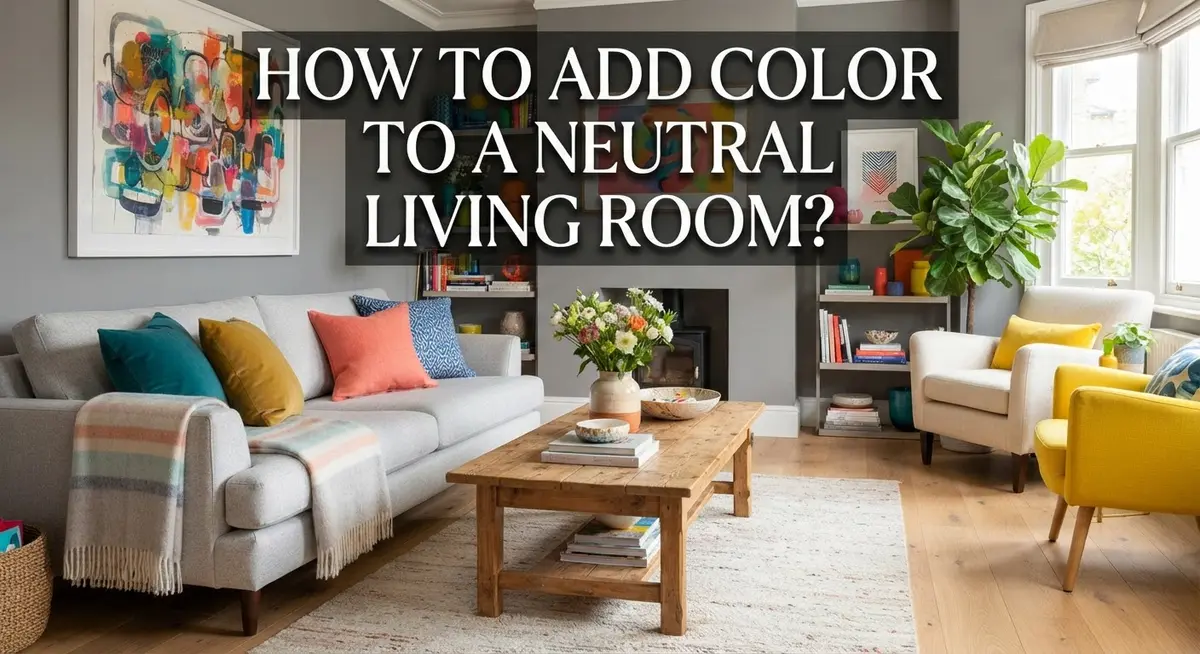
How to Add Color to a Neutral Living Room?
Do you love your neutral living room but feel like something is missing? Neutral spaces feel calm and timeless. But sometimes they cross the line into boring.
The good news is you don’t need to repaint every wall. You just need a few smart color moves.
A splash of color can turn a flat room into a warm and inviting space. It can also show off your personality without losing that soft neutral charm.
In this guide, we will show you how to bring color into your living room the easy way. You will learn where to start, like picking one or two accent colors first.
We will also cover simple tricks, like using a colored rug to anchor the room. You will see how pillows and textures work together to add depth.
By the end, you will know how to avoid the most common mistakes people make. No more “blah” rooms or spaces that feel flat.
Let’s turn your neutral living room into a space that feels balanced, bright, and truly yours.
In a Nutshell
Here’s the quick version if you’re short on time.
-
Start small. Add color through pillows, throws, or art. You don’t need to change your whole room at once.
-
Pick one or two accent colors. Too many colors can make the space feel messy. Stick to a simple palette and repeat it around the room.
-
A colored rug works great as your starting point. It anchors the room and gives you a color guide for everything else.
-
Mix textures with your colors. A smooth pillow next to a woven throw adds depth. Color alone isn’t enough; texture makes it feel finished.
-
Avoid using too much of the same neutral tone. This is a common mistake that makes rooms feel flat and boring.
-
Layer different shapes and patterns. Round, square, striped, or solid. Variety keeps the eye interested without feeling overwhelming.
-
Grey sofas need a little extra thought. Warm colors like mustard or rust often work best against cool grey tones.
Follow these simple steps, and your neutral room will feel warm, bright, and full of life.
Understanding Your Neutral Foundation
Your neutral living room starts with a solid foundation. Before you add any color, take time to understand what you already have in place.
Look at your walls first. Most neutral rooms feature whites, beiges, taupes, or soft grays. These colors create a calm backdrop. They also give you freedom to experiment with accent colors without overwhelming the space.
Next, examine your furniture. What tone is your sofa? Is it light gray, cream, or warm beige? Your main furniture pieces set the stage for everything else. They anchor the room and determine which colors will work best alongside them.
Pay attention to the lighting in your space. Natural light changes how colors appear throughout the day. A color that looks vibrant in morning sunlight might feel different in evening lamp light. Spend a few days observing how light moves through your room.
Consider the textures already present. Do you have smooth leather, woven fabric, or a mix of both? Neutral rooms often rely on texture for visual interest. Understanding your existing textures helps you layer new colors effectively.
Think about the mood you want to create. Do you prefer energetic and bold, or calm and sophisticated? Your color choices should match this feeling.
Finally, assess how much neutral tone currently dominates. Too much sameness in one shade creates a flat, uninviting space. If your walls, sofa, and curtains are all the same beige, you have more room to introduce color. If your neutrals already vary in tone and texture, you need a lighter touch.
This foundation knowledge guides every decision you make next. It prevents costly mistakes and ensures your color additions enhance rather than clash with your existing design.
Choosing the Right Accent Colors for Your Space
Choosing the right accent colors starts with understanding what works with your existing neutral palette. Look at your walls, furniture, and lighting first. These elements already set the tone for what colors will feel natural in your space.
Think about the mood you want to create. Do you prefer a calm, sophisticated feel? Consider cool accent colors like soft blues or muted teals. Want energy and warmth? Warm tones like terracotta, rust, or golden yellow work better.
Start with just one or two accent colors. This keeps your room from feeling chaotic. Too many colors compete for attention and make spaces feel busy instead of balanced.
Test how colors interact with your lighting. Natural light shows colors differently than artificial light. Spend time observing your space at different times of day before committing to accent colors.
Consider the undertones in your neutrals. Warm greys pair well with warm accent colors like coral or amber. Cool greys look better with jewel tones or soft blues. Beige walls work with almost anything, but warm accents often feel more inviting.
Think about contrast and visual interest. If your furniture is very light, darker accent colors create drama. Light accent colors on darker furniture feel airy and fresh.
Your accent colors should also complement any permanent fixtures you can’t change. Think about wood tones, metal finishes, or existing artwork.
Start small with your chosen accent colors. Add them through removable items like pillows, throws, or artwork. This lets you test your choices before making bigger commitments. You can always adjust or try different shades until you find what feels right for your space.
Starting with a Rug: Anchoring Your Color Palette
A colored rug acts as the anchor for your entire color scheme. It sets the tone and makes decisions easier going forward. Start by selecting a rug in one of your chosen accent colors.
The rug size matters more than people realize. A larger rug grounds the seating area and makes the space feel intentional. Aim for a size that fits under at least the front legs of your main furniture pieces.
Consider the rug’s undertones carefully. If your walls lean warm, pick a rug with warm undertones too. Cool walls pair better with cooler rug colors. This harmony prevents your space from feeling disjointed.
Texture plays a key role here. A smooth, flat rug feels different from a plush or woven one. Mix your rug texture with other elements in the room. This creates visual interest without overwhelming the neutral foundation.
The rug’s pattern gives you flexibility. Solid colors work wonderfully for a clean look. Patterned rugs introduce multiple colors at once, which can be helpful if you’re unsure about your palette. Geometric patterns feel modern, while organic patterns add softness.
Place your rug thoughtfully in the room. It should define the living area and invite people to sit. A well positioned rug makes the space feel organized and intentional.
Once your rug is down, everything else becomes easier. Your pillows, throws, and art now have a color reference point. You can pull accent colors directly from the rug’s palette. This approach prevents color chaos and keeps your space feeling balanced.
A colored rug transforms a bland neutral room into something with personality and purpose. It’s your starting point for building a cohesive, colorful space.
Adding Color Through Pillows, Throws, and Small Accessories
Pillows and throws are your easiest entry point into adding color without overwhelming your space. Start by choosing pillows in your selected accent colors. Place them on your neutral sofa to instantly see how the colors feel in your room.
Mix different sizes and shapes to keep things interesting. Combine a large square pillow with smaller rectangular ones. This variety prevents your seating area from looking flat or boring.
Texture matters just as much as color here. A smooth velvet pillow next to a chunky knit throw creates visual depth. Add a woven pillow alongside a silky one. These contrasts make your accessories pop and feel intentional.
Layering is your secret weapon. Start with 2 to 3 pillows in your accent color. Then add 1 to 2 in complementary neutral shades. This balance keeps your room from feeling too colorful while still breaking up the monotony.
Throws work the same way. Drape a colored throw over your sofa arm or the back. This adds warmth and invites people to get cozy. The casual placement feels more relaxed than stiff symmetry.
Don’t forget smaller accessories like decorative baskets, vases, or cushions. These items let you experiment with color gradually. If you love the look, add more. If it feels wrong, swap them out easily.
Start with just one accent color across your pillows and throws. Once you feel confident, introduce a second color. This gradual approach helps you avoid color overload while transforming your neutral space into something with personality and charm.
Layering Texture, Pattern, and Color Together
The real magic happens when you combine texture, pattern, and color into one cohesive look. This approach prevents your neutral room from feeling flat or one dimensional.
Start by mixing different textures alongside your accent colors. If you choose a jewel toned pillow, pair it with a chunky knit throw or a smooth velvet cushion. This contrast keeps the eye engaged and adds depth to your seating area.
Patterns work best when you layer them strategically. A geometric patterned pillow can sit next to a striped throw without clashing. The key is varying the scale of your patterns. Large patterns pair well with smaller, busier designs. This prevents visual chaos while maintaining interest.
Your rug becomes the foundation for this layering strategy. A patterned rug with your accent color anchors everything else. Then your pillows, throws, and accessories echo those same colors and patterns in different proportions.
Don’t forget about texture in your larger pieces too. A linen curtain adds softness. A woven wall hanging brings warmth. Textured wallpaper or a shiplap accent wall creates dimension without overwhelming your neutral base.
The spacing matters here. Distribute your colored and patterned pieces throughout the room rather than clustering them in one spot. This creates visual flow and makes the space feel intentional.
Remember that less is more when you’re starting out. Add one layered element at a time. Step back and assess how it feels. This gradual approach helps you avoid over saturating the space while building confidence in your design choices.
Your neutral foundation stays strong because you’re adding color and texture in measured doses, not replacing your entire palette.
Introducing Color to Grey and Neutral Sofas
A grey sofa serves as an excellent neutral foundation for your living room. The key is adding color in ways that feel intentional rather than random. You want your space to look planned, not like you threw things together.
Start by choosing one or two accent colors that speak to you. These colors should work with your grey sofa’s undertone. Cool greys pair well with blues, purples, and silvers. Warm greys look better with oranges, terracottas, and golds. This simple match prevents your room from feeling disjointed.
Colored pillows are your best first move. Place them on your grey sofa to test how the colors feel in your space. You can easily swap them out if something doesn’t work. Try grouping pillows in odd numbers like three or five. This arrangement feels more natural than even numbers.
A throw blanket draped over your sofa adds another color layer. It also introduces texture, which keeps grey from feeling flat and boring. Fold it casually across the arm or back for a lived in look.
Don’t stop at just the sofa. Extend your accent colors to other areas of the room through artwork, wall hangings, or decorative objects on nearby shelves. This creates visual flow and ties everything together.
The most important rule is restraint. Your grey sofa should still be the main event. Color accents should enhance it, not compete with it. A few well placed pops of color transform a grey sofa from dull to dynamic. You’ll create a space that feels both calm and interesting.
Common Mistakes to Avoid When Adding Color
Too much of the same neutral tone creates a flat, boring space. Beige walls, beige furniture, and beige accessories blend together into one dull backdrop. Your eye has nowhere interesting to land. Break up this sameness by introducing contrast through your accent colors.
Failing to balance texture with color is another common trap. You might add a bright pillow, but if everything else feels smooth and flat, the space still lacks personality. Texture and color work together. Rough fabrics, woven patterns, and varied surfaces make colored accents pop even more.
Over-saturating your room with too much color happens when you rush the process. Painting an accent wall, adding colorful furniture, hanging bright artwork, and layering multiple colored accessories all at once overwhelms the senses. Your neutral foundation disappears, and the room feels chaotic instead of intentional.
Placing color randomly without a focal point creates visual confusion. Scattered colored items around the room lack cohesion. Instead, anchor your palette with one main element like a colored rug, then build around it strategically.
Ignoring the size and scale of colored pieces matters more than people realize. One small accent pillow disappears on a large sofa. You need enough color presence to make an impact, but not so much that it dominates the entire space.
Forgetting about restraint leads to decision fatigue. You don’t need ten different accent colors. One or two colors give you clarity and sophistication. This approach keeps your neutral base strong while adding the visual interest your room needs.
Start slowly and observe how each addition changes your space. This prevents costly mistakes and lets you build confidence as you go.
Troubleshooting a Room That Still Feels Dull or Flat
When your neutral living room still feels dull after adding some color, the problem usually comes from one of three issues: insufficient contrast, mismatched color placement, or weak texture combinations.
First, check your contrast levels. Light beige walls with cream furniture and tan pillows create visual monotony. Your accent colors need to stand out noticeably against this backdrop. If your colored pieces blend into the neutral tones, they won’t create the pop you need. Consider whether your accent color is truly different enough from your base palette.
Second, examine where you’ve placed your color. Random placement confuses the eye and makes rooms feel scattered. Color works best when grouped strategically around a focal point like your sofa, a console table, or an accent wall. Clustering similar colors together creates visual weight and interest.
Third, assess your texture variety. Color alone cannot save a flat room. A solid colored pillow on a smooth sofa against plain walls still reads as dull. Add varied textures like woven baskets, knitted throws, patterned rugs, or natural wood elements alongside your colors. These layers create depth and dimension that flat surfaces cannot achieve.
Finally, evaluate your color saturation. Sometimes rooms feel lifeless because accent colors are too muted or washed out. A soft, dusty blue might disappear, while a vibrant teal commands attention. Don’t fear bolder shades if your current setup feels uninspiring.
Start by adding one bold textured piece in your accent color. Observe the change for a few days. This approach prevents overwhelming your space while revealing exactly what your room needs next.
Final Thoughts
Adding color to a neutral living room does not need to feel scary. You already have the tools to make it work. Small steps create big changes over time.
Start with your rug. Choose one or two accent colors you love. Then build slowly from there.
Pillows, throws, and small decor pieces let you test color without big commitment. If something feels off, you can swap it out easily. This low risk approach helps you learn what you like.
Texture matters just as much as color. A room with only flat, smooth surfaces feels boring even with bright colors added. Mix in woven baskets, knitted throws, and textured cushions.
Remember that neutral does not mean boring. Your beige, grey, or white base is a canvas, not a limitation. Color pops give that canvas life without overwhelming the space.
Watch out for the common traps. Too much of one neutral tone flattens a room. Random color placement confuses the eye. Rushing the process leads to clutter instead of style.
Give yourself permission to go slow. Add one piece. Live with it for a week. Then decide what comes next.
This patient approach builds a room that feels intentional, not accidental. Every choice supports the next one.
Your neutral living room is not stuck being dull forever. With the right balance of color, texture, and pattern, it can feel warm and inviting.
Trust your instincts here. You know your space better than anyone else does. Use these tips as a guide, then make the room truly your own.
Frequently Asked Questions
What’s the best starting point if my neutral room feels too bland?
Start with a colored rug. A rug anchors your entire color scheme and gives you a foundation to build from. Choose one that speaks to you, then pull accent colors from that rug for pillows and other decor. This approach prevents random color choices that don’t work together.
Can I add color to a grey sofa without replacing it?
Absolutely. Layer colored pillows and throws on top of your grey sofa. Start with two accent colors in pillow form. Add a textured throw blanket in a complementary shade. This method lets you test colors before committing to larger purchases.
How many accent colors should I use in a neutral room?
Stick with one or two accent colors maximum. Too many colors compete for attention and create visual chaos. Pick colors that complement each other, then repeat them throughout your space in different forms like pillows, artwork, and decor pieces.
Why does my room still feel flat even after adding color?
The issue usually comes from missing texture. Color alone isn’t enough. Mix smooth surfaces with rough textures, shiny with matte finishes, and soft with structured pieces. A colorful pillow on a flat sofa still feels boring. Add varied textures alongside your color choices.
Should I add all my color at once or gradually?
Go slow. Add one colored piece, then observe how it changes your space. This prevents costly mistakes and builds confidence in your choices. Gradual changes let you spot what works and what doesn’t before investing more.

Phil is the founder and creative mind behind Aesthetic Space Finds, a home decor enthusiast dedicated to helping people transform their living spaces through honest product reviews, in-depth comparisons, and expert buying guides. With a keen eye for design and a passion for discovering hidden gems in the world of home accessories, Phil curates content that makes stylish, functional living accessible to everyone.


