
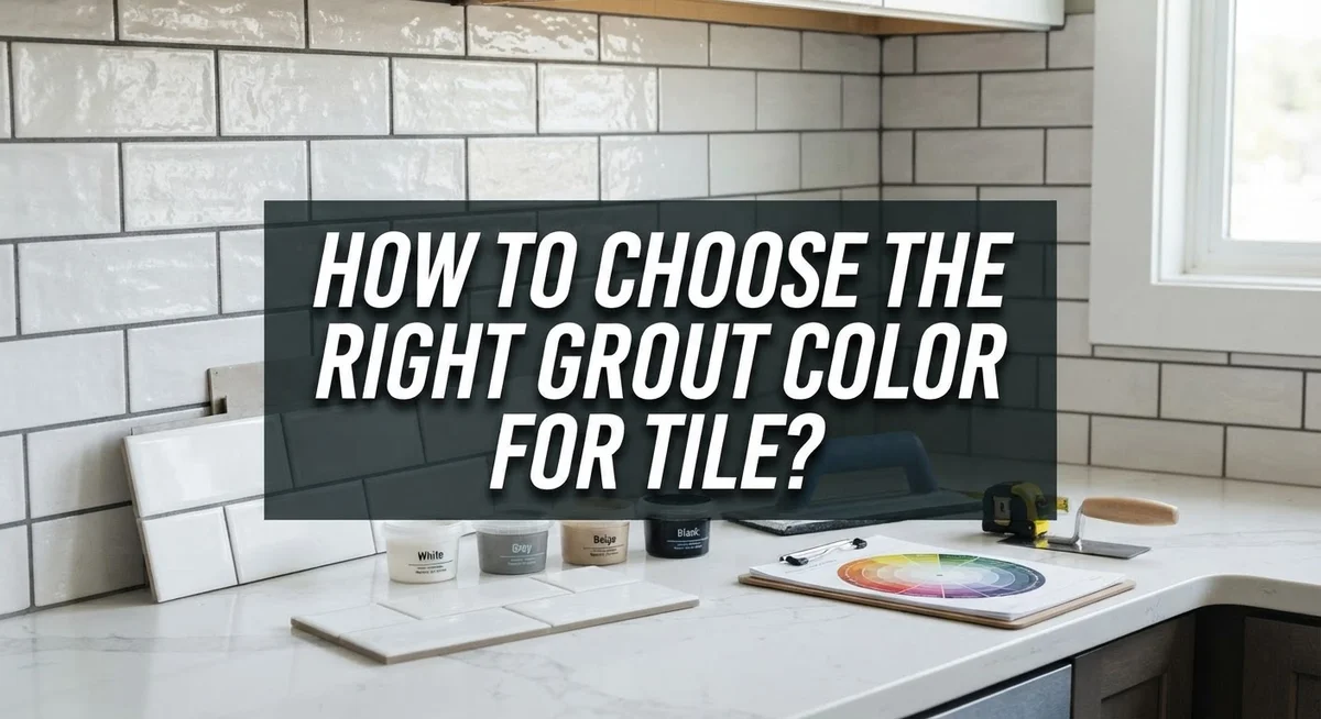
How to Choose the Right Grout Color for Tile: A Complete Guide
Grout might seem like a small detail. But it can make or break your tile design.
The right grout color pulls your whole space together. The wrong one can distract from beautiful tile work you love.
Many homeowners focus only on tile choice. They forget grout plays a huge role too.
Grout color affects the final look more than most people expect. It can blend in or stand out. It can highlight your tile pattern or hide it completely.
This guide walks you through everything you need to know. You will learn the difference between matching and contrasting grout. We cover how undertones affect your final result.
We also share smart tips for testing grout samples correctly. You will discover which colors work best for floors versus walls. Plus, we point out common mistakes people make during selection.
By the end of this article, you will feel confident picking grout color for your project. No more guessing. No more surprises after installation.
Let’s explore how to choose grout color that truly complements your tile.
In a Nutshell
Picking the right grout color does not have to feel tricky. Here is a quick summary to guide your choice.
-
Decide between matching or contrasting grout. Matching grout gives a smooth, seamless look. Contrasting grout makes each tile pop and shows off the layout.
-
Check the undertone of your tile. Warm tiles pair well with warm grout. Cool tiles look best with cool grout shades.
-
Test grout on a full tile section. Small color chips do not show the true effect. Place samples right against tile edges before deciding.
-
Match grout choice to the surface. Floors need medium or dark grout to hide dirt and wear. Walls allow more freedom, including lighter shades.
-
View samples under real lighting. Natural and artificial light change how grout looks. Always check colors in the room where you will use them.
-
Stick with versatile options if unsure. White, light grey, and dark grey grout work with almost any tile style. These safe choices rarely go wrong.
A little planning now saves frustration later. Testing properly helps you avoid costly mistakes.
Why Grout Color Matters More Than You Think
Grout color acts as the invisible framework of your tile installation. Even though grout occupies a small percentage of your surface, it controls how your entire space feels and functions.
Think of grout as the picture frame around your tiles. A well chosen frame makes the artwork shine. Poor grout selection can make beautiful tiles look disconnected or dated. The color you pick influences whether your space feels modern, traditional, cozy, or clean.
Grout serves practical purposes beyond aesthetics. On floors, darker grout hides dirt, dust, and footprints much better than light options. This saves you from constant cleaning and makes your space look maintained longer. Light grout on high traffic floors shows every speck of dust and requires frequent scrubbing.
The grout color also defines visual patterns in your room. Matching grout to your tile creates a flowing, unified appearance that makes spaces feel larger and more open. Contrasting grout outlines each tile clearly, which emphasizes geometric patterns and adds visual interest. This choice dramatically changes how your eye reads the space.
Color undertones matter significantly. Warm grout with yellow or orange tones works beautifully with warm toned tiles. Cool grout with blue or grey undertones complements cool toned tiles. Mixing warm and cool undertones creates visual tension that can feel jarring.
Lighting conditions affect how grout color appears throughout the day. Natural sunlight shows true color, while artificial lighting can shift warm or cool tones. Your grout might look completely different at noon versus evening.
Understanding grout’s impact helps you make intentional choices rather than random selections. You recognize that this small detail shapes your entire design vision. The right grout color transforms a tile project from acceptable to exceptional.
Matching vs. Contrasting Grout: Understanding the Two Approaches
Matching grout means selecting a color that blends with your tile. This approach creates a unified, flowing appearance across your surface. The eye sees fewer interruptions, which makes spaces feel larger and more open.
Contrasting grout does the opposite. You pick a color that stands out against your tile. This method highlights each individual tile and creates a visible grid pattern. Subway tiles and geometric designs often look striking with contrasting grout.
The choice between these two depends on your design goals. Matching grout works well when you want a clean, modern aesthetic. It emphasizes the tile texture and color itself rather than the grout lines. Your focus stays on the tile’s beauty.
Contrasting grout excels at defining structure. It draws attention to layout and pattern. If your tile has interesting shapes or you want architectural detail to pop, contrast does this job well. Dark grout against light tile creates drama. Light grout against dark tile offers subtle definition.
Consider your room’s purpose when deciding. Bathrooms benefit from either approach, but kitchens often look better with matching grout since it appears cleaner. Floors in high traffic areas hide dirt better with matching medium or dark grout.
Undertone matters in both cases. Warm grout has yellow or orange hints. Cool grout leans toward blue or grey tones. Match your grout undertone to your tile undertone for a cohesive result, even if you choose contrasting colors.
Test both approaches before committing. Get samples of matching and contrasting options. Place them directly against your tile in the actual room. View them under your home’s lighting at different times of day. This real world testing reveals which approach suits your space best. What looks good on a color chart may feel different once installed.
Reading Undertones in Your Tile Before Choosing Grout
Understanding tile undertones is your first step toward picking grout that enhances your space. Every tile contains either warm or cool undertones, even if you don’t notice them at first glance.
Warm undertones appear yellowish, peachy, or orange in your tile. These tones feel cozy and inviting. Cool undertones lean toward blue, gray, or purple shades. They create a crisp, modern feeling.
Look at your tile in different lighting. Natural sunlight reveals undertones better than artificial light alone. Stand near a window and examine your tile sample closely. Notice if the color seems to lean warm or cool.
Check the tile’s edges and grout lines if any exist. The edges often show undertones more clearly than the flat surface. This trick helps you spot subtle color hints that might hide on the main tile face.
Compare your tile against white paper or a neutral background. This removes competing colors and lets you see the true undertone. Move the tile around the room to watch how light changes its appearance throughout the day.
Warm tiles pair naturally with warm grout colors. Light cream, tan, or warm gray grout complements warm tile beautifully. Cool tiles work best with cool grout options like light gray, white, or charcoal.
Mismatched undertones create visual confusion. Warm tile with cool gray grout can feel disconnected and jarring. The space loses harmony even though both colors seem fine individually.
Take time to study your specific tile before shopping for grout. Spend at least a few days observing it in your actual space. Notice how morning light differs from afternoon light. This observation period prevents costly mistakes and ensures your final choice feels intentional and cohesive.
Step-by-Step Process for Testing and Selecting Grout Color
Testing grout color requires more than looking at a tiny swatch. You need to see how the color actually appears on your tiles in real conditions.
Start by getting grout samples in your top color choices. Request larger sample tiles or cards that show the grout color applied between actual tile pieces. This matters because grout occupies the space between tiles, and that relationship determines the final look.
Position your samples directly against your tile. Hold them tight along the grout lines where the tile meets. This shows you the true visual effect. A color that looks perfect on a chart often looks different when placed next to your specific tile shade and texture.
Test samples in multiple lighting conditions. Check them in natural daylight near your windows. Then evaluate them under artificial indoor lighting. Grout color shifts dramatically depending on light type. What appears neutral in morning sun might look too yellow under evening lamps. Spend time observing the samples at different times of day if possible.
Create a larger test area if you can. Apply actual grout between a few of your tiles temporarily. This gives you the most accurate preview of the finished result. Small samples don’t capture how your eye perceives color across a larger surface.
Document what you observe. Take photos of your samples in different lighting. This helps you remember how colors appeared and compare options objectively later.
Pay attention to how the grout color affects the overall tile pattern. Does it make the tiles pop or blend together? Does it emphasize the grid layout? Does it feel cohesive with your room’s design?
Never choose grout color based solely on the store’s display lighting. The conditions in a showroom rarely match your actual home. Take samples home and live with them for a few days. This simple step prevents costly mistakes and ensures you select a color you’ll appreciate for years.
Matching Grout Color to Floor Tile vs. Wall Tile
Floor tiles and wall tiles serve different purposes in your home, so their grout color needs differ too. Understanding these distinctions helps you pick the right shade for each surface.
Floor tile demands durability first. Grout on floors gets walked on, accumulates dirt, and shows wear quickly. Medium to dark grout colors hide these issues better than light shades. Dark gray or charcoal grout masks footprints and dust. Light grout on floors requires frequent cleaning to maintain its appearance. If you prefer lighter grout on floors, expect more maintenance work.
Floor grout also experiences more moisture and temperature changes than wall grout. These conditions can cause grout to crack or discolor over time. Selecting a color that already has depth helps mask future staining and wear patterns.
Wall tile offers much more flexibility. Your walls don’t get stepped on or collect as much dirt. Light grout colors work beautifully on walls without the maintenance burden they create on floors. White or light gray grout on walls creates an airy, open feeling. You can also use bolder contrasting grout on walls to define tile patterns without worrying about dirt visibility.
The visual impact differs between surfaces too. Floor grout becomes part of your everyday view and affects how spacious your room feels. Wall grout contributes to your room’s overall aesthetic but doesn’t experience the same traffic stress.
Consider your design goals separately for each surface. You might choose matching grout for walls to emphasize brightness while using darker grout on floors for practicality. This mixed approach gives you both beauty and durability.
Test your grout samples on both floor and wall tiles in their actual locations. Lighting, tile size, and surface angle all change how grout color appears. What works beautifully on a wall sample might disappoint on your floor once installed.
Most Versatile Grout Colors and When They Work Best
White grout works beautifully with almost any tile color. This neutral option creates a clean, modern look. It pairs well with both warm and cool tile undertones. White grout makes spaces feel bright and open.
Light grey grout offers similar versatility to white. It blends seamlessly with most tile palettes. Light grey hides minor imperfections better than pure white. This color works equally well on floors and walls.
Dark grey grout provides excellent contrast and flexibility. It outlines tile shapes clearly, which emphasizes your tile pattern. Dark grey pairs naturally with both light and dark tiles. This option hides dirt and stains effectively on high traffic floors.
The reason these three colors work so well is simple. They sit in the middle ground between matching and contrasting approaches. You get some visual definition without overwhelming your tile design. These colors complement rather than compete with your tiles.
White works best when you want a seamless, unified appearance. Choose white if your tiles are light colored or neutral. Light grey becomes your go to when you prefer subtle grout lines. This shade blends in without disappearing completely.
Dark grey excels in kitchens and bathrooms where durability matters. It handles foot traffic, moisture, and dirt remarkably well. Dark grey also defines geometric patterns like subway tile or large format tiles. The contrast makes your tile layout a design feature rather than an afterthought.
Test all three colors against your specific tiles before deciding. Lighting in your home differs from store showrooms. A sample that looks perfect under fluorescent lights might disappoint in natural daylight. Position your samples along actual grout lines where your tiles will meet. This reveals how the color truly affects your overall design. Versatile colors succeed because they adapt to your space rather than demanding it adapt to them.
Common Mistakes to Avoid When Choosing Grout Color
Choosing grout color seems simple until you make a mistake that affects your entire tile installation. Here are the errors most people encounter and how to avoid them.
The biggest mistake happens when you pick grout color from a tiny swatch at the store. Those small color chips don’t show you how the grout will actually look alongside your full tile. What appears perfect on a 2-inch sample often looks completely different once installed. Always request larger samples or test patches before committing to your choice.
Many people underestimate how much the grout color will shift once it dries. Wet grout looks darker and richer than the final dried product. This means your grout might appear lighter than you expected after installation completes. Request dried samples whenever possible, or ask your installer to show you examples of previously completed work using that specific grout color.
Failing to consider the undertone creates visual confusion throughout your space. A warm beige grout clashes with cool-toned grey tiles, even if the darkness levels match. Always verify whether your chosen grout has warm or cool undertones and ensure it complements your tile’s undertone.
Choosing dark contrasting grout without thinking about maintenance is another common pitfall. Dark grout shows every speck of dust and requires frequent cleaning. This works fine for wall tile but becomes exhausting on kitchen or bathroom floors where dirt accumulates quickly.
Ignoring your specific lighting conditions leads to regret. Store lighting differs dramatically from your home’s natural and artificial light. That grout color might look perfect under fluorescent showroom lights but appear dull or yellow in your actual space. Test your samples in your home’s real lighting at different times of day.
Finally, people often forget that grout color affects how your tile pattern reads visually. Matching grout creates a seamless look, while contrasting grout outlines each tile. Think about whether you want your tile layout emphasized or hidden before making your final selection.
Final Thoughts
Choosing the right grout color takes some thought, but it does not need to feel overwhelming.
Start with your tile and think about the look you want. Do you want a seamless blend or a bold contrast?
Remember the basics we covered. Floor tile needs durable, dirt hiding grout. Wall tile gives you more freedom to experiment.
White, light grey, and dark grey remain your safest choices. These colors work with almost any tile palette you already have.
Always test your grout before committing to it. Buy small samples and apply them directly to your tile.
Look at these samples in your own home lighting. Store lighting never matches what you have at home.
Check the samples morning, noon, and night. Grout can look different depending on the time of day.
Pay attention to undertones in both your tile and grout. Warm and cool tones need to work together, not against each other.
Think about long term care too. Darker grout hides stains well, but it still needs regular cleaning.
Lighter grout shows dirt faster, especially on floors. Weigh beauty against practicality before you decide.
Take your time with this decision. Grout affects your tile’s entire appearance for years to come.
Trust the testing process more than any color chart. Real samples on real tile always tell the truth.
Your grout choice does not have to be complicated. Simple planning and careful testing lead to results you will love.
At the end of the day, the best grout color is the one that fits your space, your lifestyle, and your personal taste. Choose confidently and enjoy your finished tile project.
Frequently Asked Questions
What is the main difference between matching and contrasting grout?
Matching grout blends with your tile color. This creates a seamless, unified look that makes your space feel larger and brighter. The tile becomes the star, and grout stays in the background.
Contrasting grout stands out against your tile. It outlines each tile shape and emphasizes your grid pattern. This approach works especially well for subway tiles or decorative layouts where you want to highlight the design.
Why should I test grout samples in my home instead of the store?
Store lighting is different from your home lighting. A grout color that looks perfect under fluorescent lights may appear too yellow or too blue in natural daylight.
You need to see samples in morning light, afternoon light, and evening light. Position the samples right against your tile edges for accuracy. This shows you exactly how the colors will interact once installed.
Does grout color matter more for floors or walls?
Grout color matters for both, but floors need more practical consideration. Floor grout gets dirty faster and shows wear more visibly. Medium to dark grout hides dirt better and requires less frequent cleaning.
Wall tile offers more flexibility. You can choose lighter grout without worry since walls don’t collect dust and debris like floors do. Your design preferences matter more here.
How do undertones affect my grout choice?
Undertones are the hidden colors within your grout. Warm undertones lean yellow or orange. Cool undertones lean blue or gray.
Your tile also has undertones. When they clash, your space looks confused and disconnected. Match warm undertones with warm, or cool with cool, for a harmonious result.

Phil is the founder and creative mind behind Aesthetic Space Finds, a home decor enthusiast dedicated to helping people transform their living spaces through honest product reviews, in-depth comparisons, and expert buying guides. With a keen eye for design and a passion for discovering hidden gems in the world of home accessories, Phil curates content that makes stylish, functional living accessible to everyone.


